R Histograms
A histogram is an accurate representation of the distribution of numerical data. R provides hist() function to generate a histogram. This function takes a vector as input. It is similar to the bar chart except a bar graph relates two variable, but a histogram relates only one variable.
Syntax of histograms
hist(x,xlab,ylab,xlim,ylim,main,col,border,break)x - x is the data to plot on graph.
xlab, ylab - xlab and ylab are the levels for x and y axis respectively.
xlim, ylim - xlim and ylim are the maximum x and y axis limit scales respectively.
col - col attribute sets the color of the bar.
border - border attribute is used to set border color.
break - break attribute sets the distance between each bar .
main - main attribute is to give a title to the graph.
Example of R Histograms
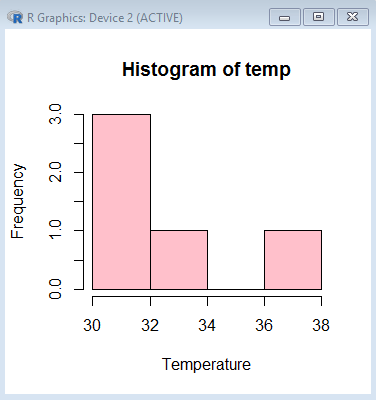
The example below contains temperature records in a vector name temp. We pass this vector as an argument in hist() function, also we set the color and border color of bar.
> temp <- c(30, 32, 34, 30, 38)
> hist(temp, col='pink', border="black", xlab='Temperature', ylab='Frequency', breaks=5)
The above code generates this graph.