R Scatter Plots
The scatter plot is a type of plot, especially to show the relationship between two variables. One of the two variables is scaled horizontally and the other is scaled vertically, and the graph is plotted on a Cartesian plane based on these variable positions.
There are many functions to create a scatter plot, but the simplest one is a plot() function.
Syntax of plot() function
plot(x, y, main, xlab, ylab, xlim, ylim, pch)Here, x and y are mandatory parameters and rest are optional. The main attribute is the title of the graph, xlab and ylab are to set the labels for x and y axes, xlim and ylim is the maximum x and y axis limit scales and pch specify a particular type of symbol. There are twenty five plotting symbols are available in pch.
Example of R Scatter Plots
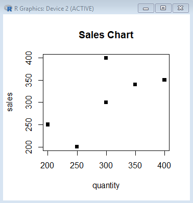
Suppose, we have the following quantity and sales chart table.
| Quantity | Sales |
| 400 | 350 |
| 300 | 200 |
| 350 | 340 |
| 300 | 340 |
| 250 | 200 |
| 200 | 200 |
We store the above quality and sales values in two different vectors and pass these as an argument in the plot function.
> quantity <- c(400, 300, 350, 300, 250, 200)
> sales <- c(350, 400, 340, 300, 200, 250)
> plot(quantity, sales, main='Sales Chart', pch=16)
The above code plots the following diagram.
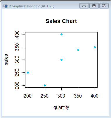
Set color of R plot
We can also set color on the graph.
> quantity <- c(400, 300, 350, 300, 250, 200)
> sales <- c(350, 400, 340, 300, 200, 250)
> plot(quantity, sales, main='Sales Chart', pch=16, col='#00CCFF')
The above code generates this graph.